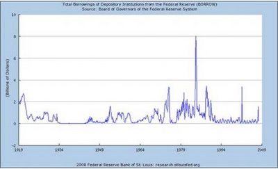
Federal spending for the last 100 years.
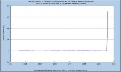
Now, same chart adding the last 100 days.
Post a Comment
Enter your email address:
Delivered by FeedBurner
Subscribe in a reader


No comments:
Post a Comment